
Chevrolet Performance Parts Redesign - UI/UX Case Study
Responsive Web Design.
The Challenge
Chevrolet Performance Parts is a marketing website that leads the users to the e-commerce site to shop for parts. The goal of this site is to educate users with various categories of performance parts. Our challenge was to restructure and redesign old site to make the user experience more seamless. 90% of the end users are mobile users for this site so this was a mobile first design keeping in mind the responsive element.
The Solution
Created a more streamlined experience with an intuitive UI that’s easy for the users to navigate through different parts categories. Focus was also given to the best performing engines those were given hero treatments with dedicated pages for quality user experience for each. It was a collaborative effort between the strategy, UX, UI and development team.
Overview
Project : Responsive web app redesign and restructure
Client: General Motors
Platform: Nexus
Role: Lead UI Designer | Project Lead
Methods: Project Proposal | Define Objective | KPI | Content Grid | Brainstorming | Research User requirements | Rapid Prototyping | Competitive Analysis | Key Features | Screen Designs | User Testing | Feedback | Iterations
Skills: User Research | Low Fidelity Wireframes | High Fidelity Wireframes | Mockups | Prototype
Tools: Figma, Adobe Photoshop,
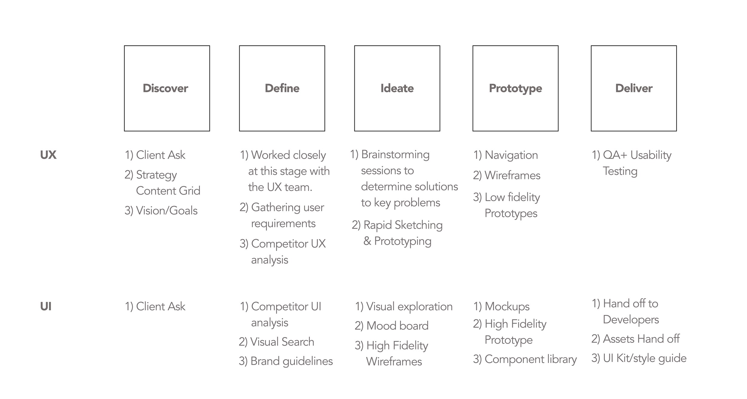
Process
Even though UI and UX was more structured into separate teams, I worked very closely with the lead UX designer since the beginning to understand their process. I participated in initial brainstorm sessions and rapid wireframing. We worked on solutions to optimize the user experience to better cater to it’s end users, in this case the DIYer enthusiasts who are in looking for high efficiency performance parts.
Once the wireframes were digitized, we prepared a mood board for visual concepts. After round of back and forth feedback between the internal team and clients a visual direction was finalized. We then developed a UI style guide based on Chevrolet brand library and applied the UI styling to 30+ pages. We worked with Small and Large breakpoint as this is a responsive web app.
Wireframing
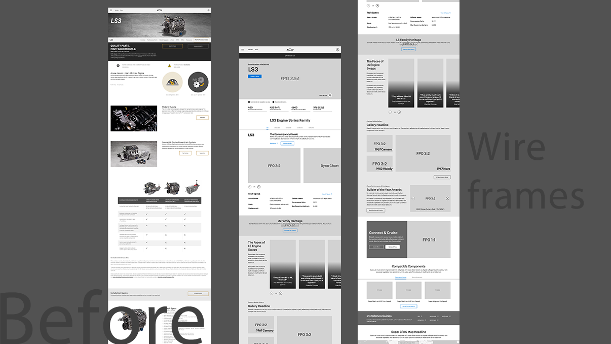
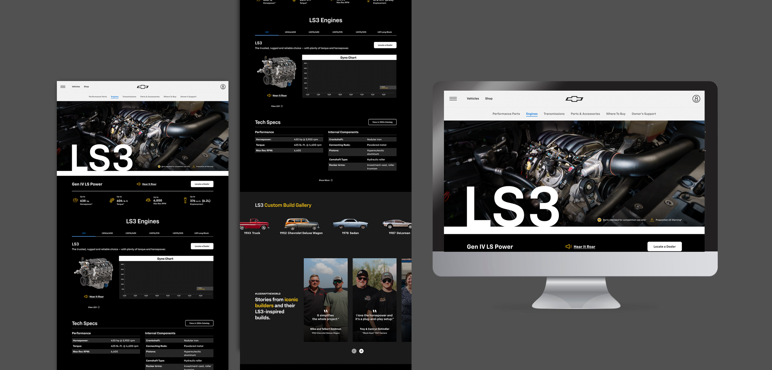
Far left is the old LS3 engine page. We worked on identifying key user pain points. The main focus was to make the information that user looks for easily accessible on the page. That included giving these high performing engines the hero treatment, highlighting the specs such as horsepower, capacity etc and including the dyno chart. We also identified that the old site lacked humanity angle and incorporated them by including real DIY stories.
UI Exploration


We created mood boards to determine a visual direction and included some inspiration pieces, based off of that we started exploring layouts for each section while keeping usability and accessibility in mind. I rely heavily on contrast checker when I work on any UI design to make sure the design, color and other elements meet the accessibility standards.
Design Rationale - After a lot of internal feedback rounds, collaborating with Chevrolet brand teams to ensure we are following Chevy guidelines, we landed on a dark theme for this redesign, the reason is we wanted to the UI to evoke robust emotions as it represents powerful performance, horsepower. Dark background also provided a good contrast against the portraits of the DIYers, DIY vehicles and engine images. White color background was used as 70:30 ratio to break that dark tone a bit. It also adhered to the latest Chevrolet’s Vis id update. We utilized the white background to showcase product images that stand out better.
UI Process


Throughout the UI process every decision was measured against UI/UX parameters/standards, functional requirements and key takeaways.
Final Screens
Take a minute to write an introduction that is short, sweet, and to the point. If you sell something, use this space to describe it.
